Intro to Italics
It’s hard to design on a slant!
We are used to thinking in terms of right angles. Up and down. Right and left.
But even our right angle coordinate system didn’t start out that way…
Origins of Slants
Origins of Rectangular System
Our coordinate system is called the Cartesian system after Rene Descartes. He linked geometry and algebra—the foundation for vector fonts.
However, the lines weren’t always at right angles.
Check out this grid:
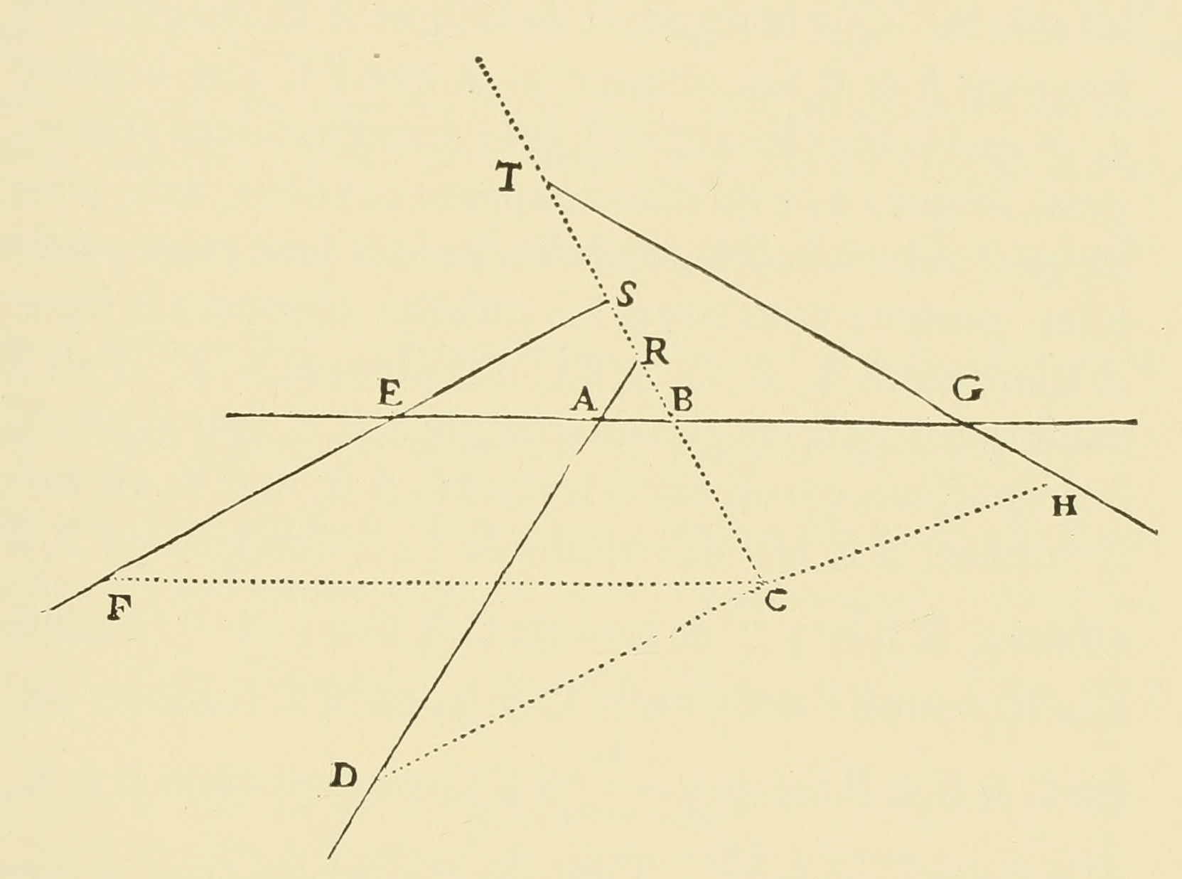
OK, well Descartes called AB and BC is primary lines, but in some ways they act like axes.
Those two main lines look a bit like a backward sloping oblique!
So you can see that the system was not always rectangular.
This would be like having your Y-axis slanted at an angle.
Original Italics
Here’s some historical italics to whet your apetite.
Look at how beautifully these are designed!
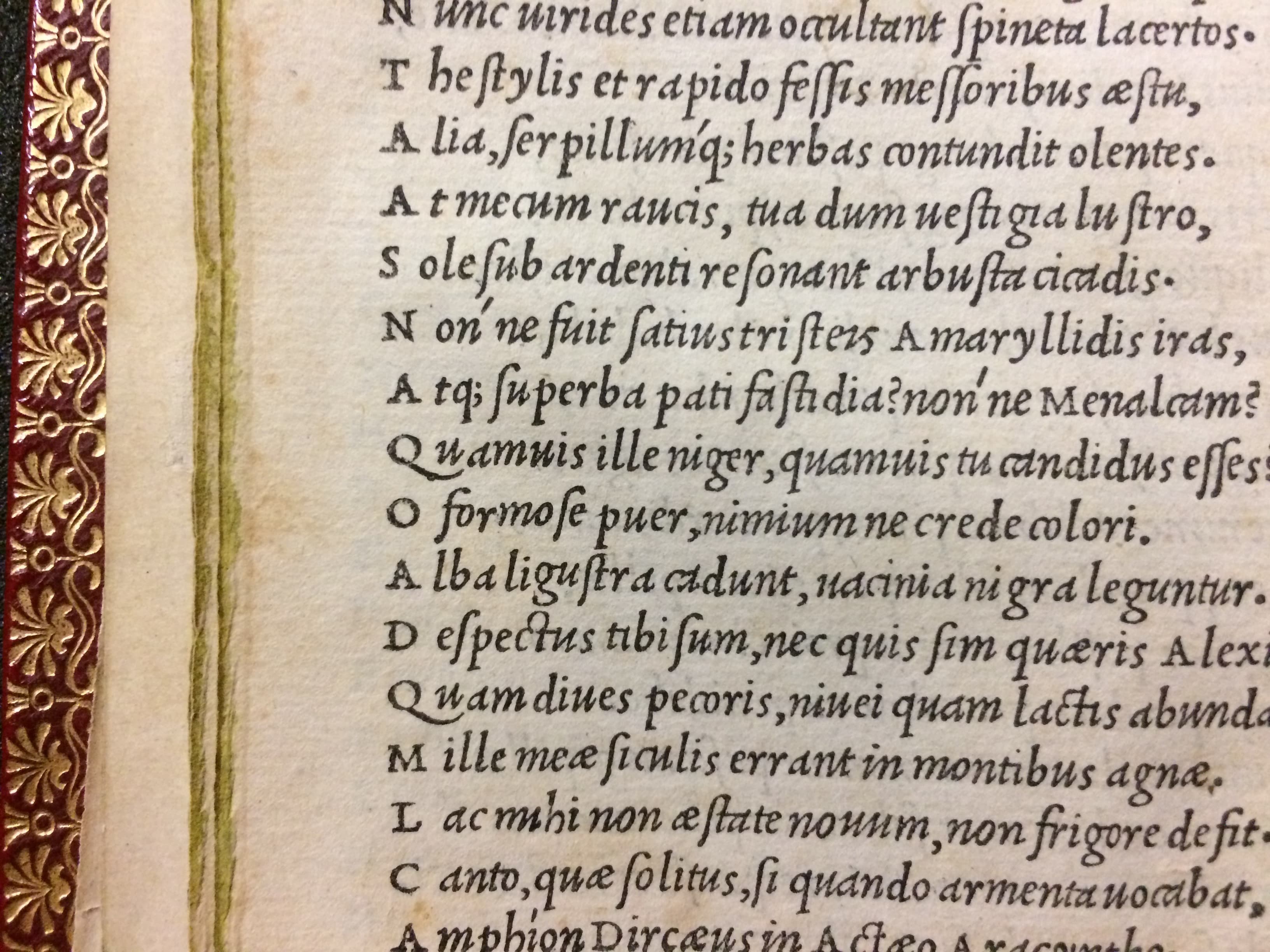
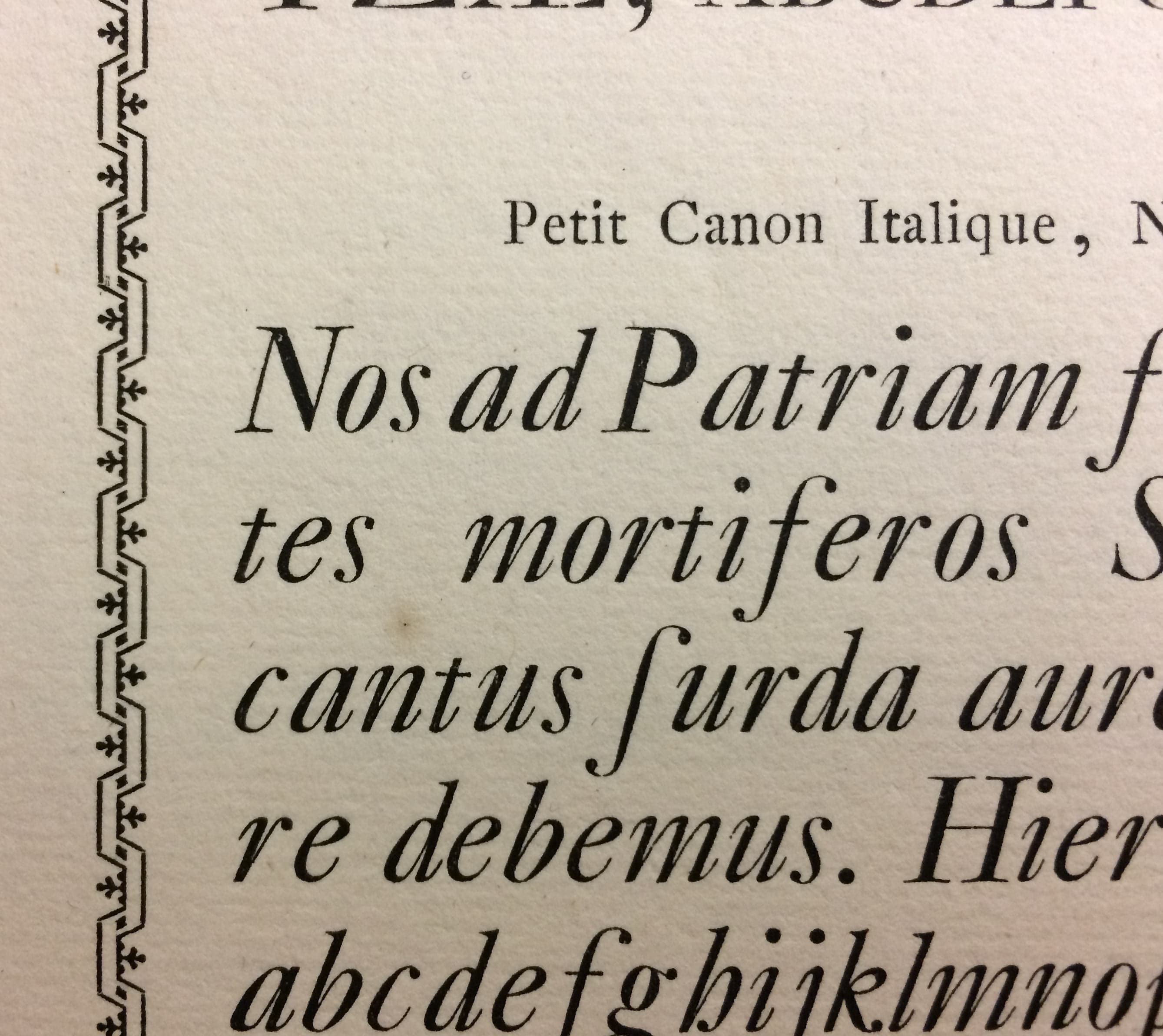
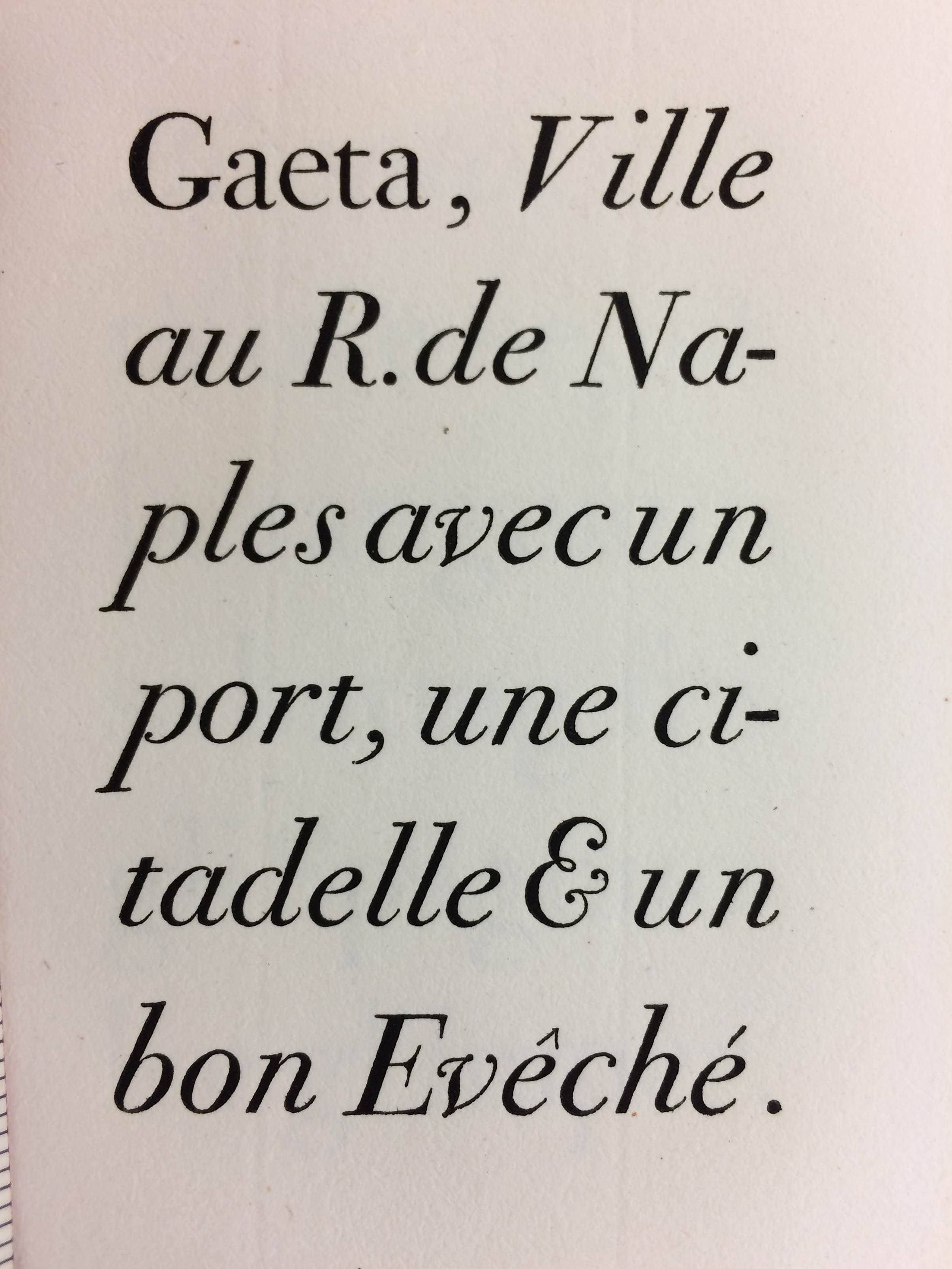
I’ve also labeled the angles so you can get an idea of what different slants look like.
Original italics were very lively, derived from chancery. (While roman derives from humanist miniscule). Aldus Manus’s Virgil is credited with containing the first italic type.▼ (Varied slant of about 12°-17°.)
© 2017 Dave Lawrence
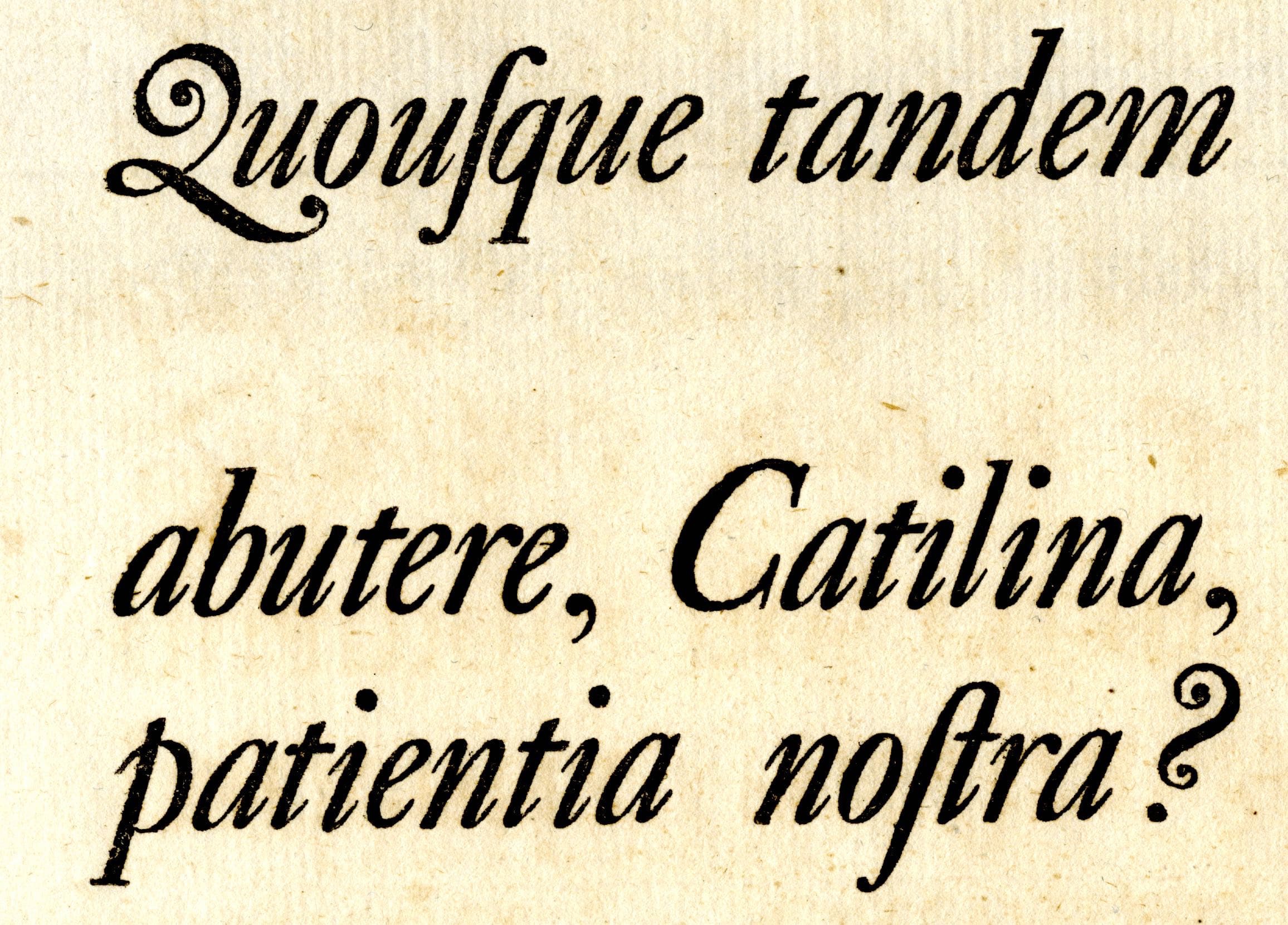
Caslon’s French Canon from his 1738/1741 specimen. (≈22° slant)▼
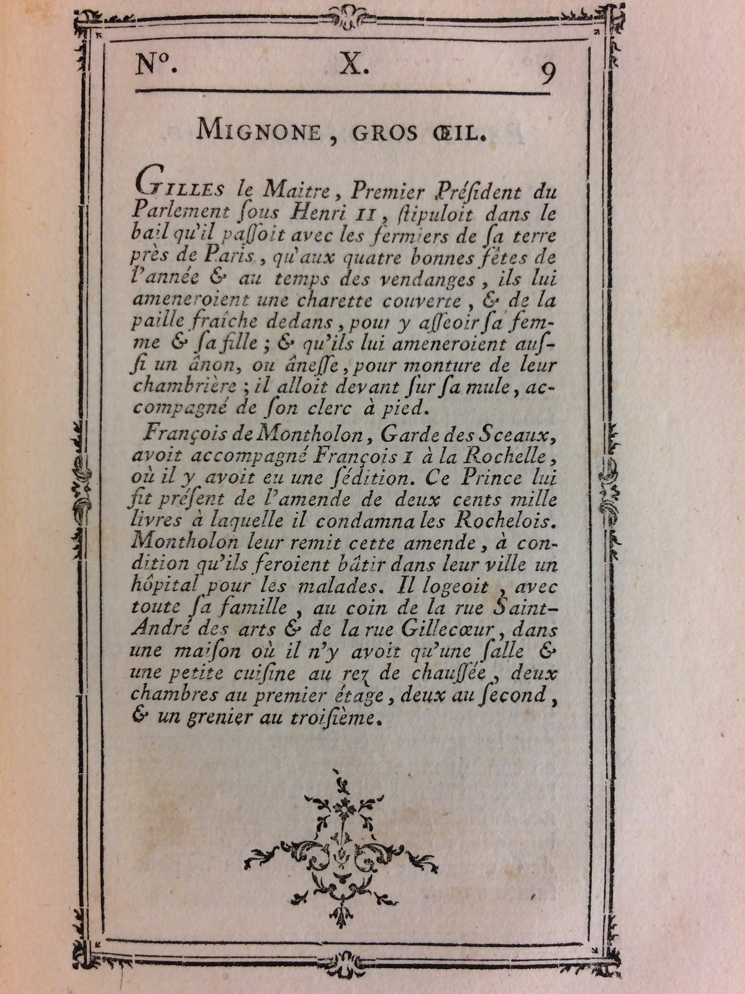
Fournier Italic. A more calm take on the genre. (≈17° slant)▼
© 2017 Dave Lawrence
Rosart Italic▼ (≈24° slant)▼
© 2017 Dave Lawrence
Bodoni Italic (19°-24°, and ≈30° for the V)▼
© 2017 Dave Lawrence
So we talked about italics. Let’s look at obliques. Obliques look less like handwriting and more mechanically slanted.
Sloped Romans (Obliques)
Font designers have a strange relationship with the slant.
Some make beautiful flowing italics and scripts.
Other just want the computer to do it.
A typeface designer, Linn Boyd Benton, created the Benton Pantograph (1899) that could do the sloping for him!
Then later type designers and foundries were trying to get away with sloped romans.
Most notable Stanley Morison (of Times New Roman fame) wrote a paper called the ‘Ideal Italic’ in which discussed using sloped romans instead of italics. (Letters of Credit p.61 – 63)
Then came the dreaded computer slant!
One font designer who was know for his attention to detail—Adrian Frutiger—used the computer to slope his Avenir font!
Instead of drawing it out! (We’re talking about someone who had his interpolations (instances) corrected for individual letters in his Frutiger font.)
To his credit, he used only an 8° slant, minimizing computer distortions.
Types of Slanted Letters
Here are the basic slanted letters. These are the types usually paired with uprights in a normal family. (Normal family is Regular, Italic, Bold, and Bold Italic.)
The outer ones are the most common.
Italic sans is also very common, but not quite as much as the other two.
Oblique romans are rare.
Italics tend to be more lively than obliques. However, you’ll see that this is not always the case.
Problems in Slanting
There’s a lot of problems you can have with Italics and Obliques!
1 Working on a Slant
As we’ve seen above, people will do a lot not to have to work on a slant!
However sometimes working with a slanted grid is easier. Other times it is more difficult.
FontLab allows you to have the grid be upright, or slanted at any angle like Renee Descartes.
This flexibility means you can get the solidity of the rectangular grid. Or you can get the sloping motion of the angled grid.
You will also see some reasons to have it one way or the other.
2 Italic Looks Too Similar to Upright
This is a problem with many typefaces.
Obliques are supposed to be just slants of the roman.
However, italics can have their own mood.
Think about it like a family.
Each person is similar, but they are all unique in their own way.
You don’t necessarily want a font family where the upright and italics are basically twins!
3 Optically Correcting Obliques
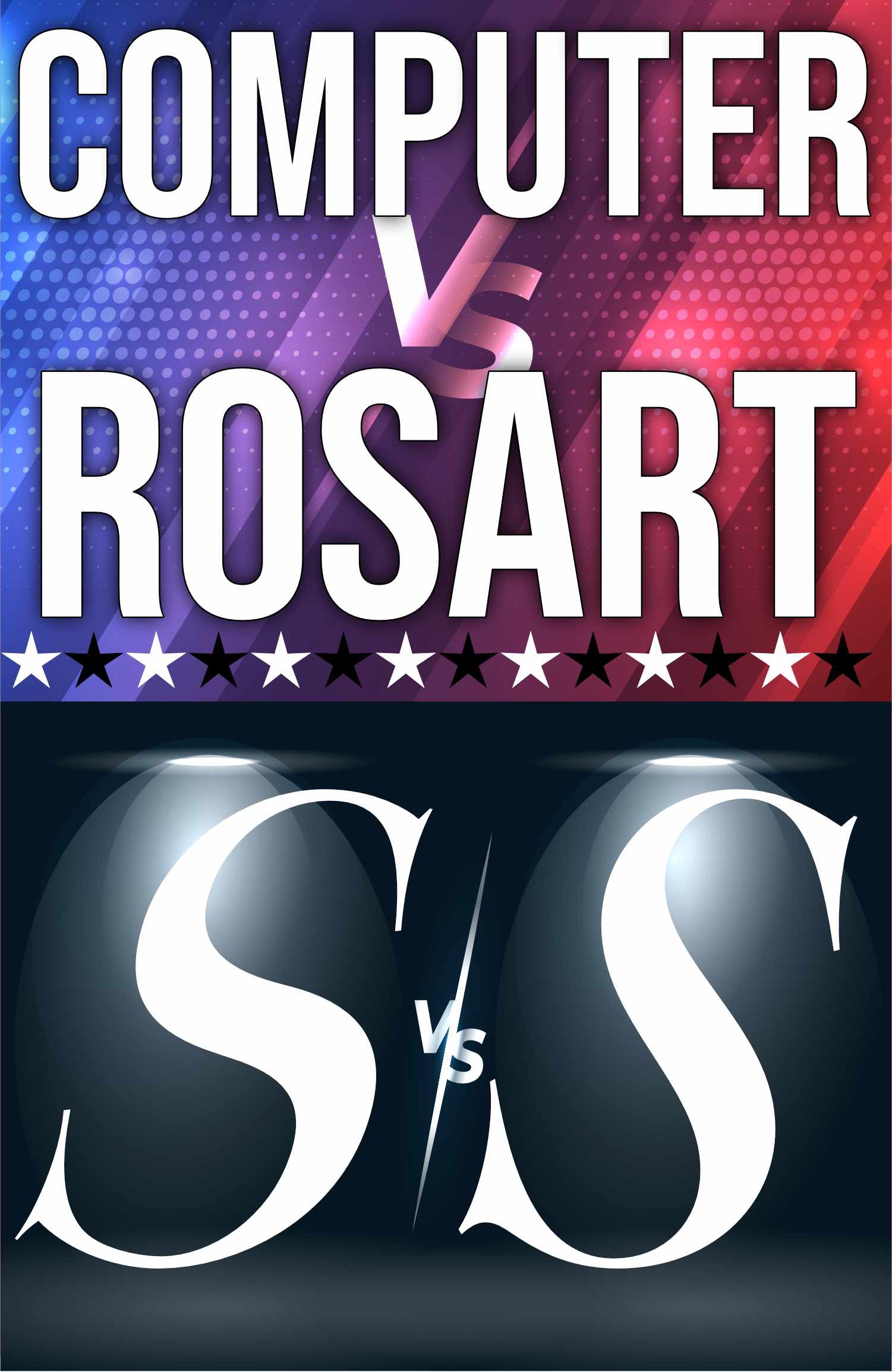
If you’ve ever sloped an S using a computer, you know that the computer sort of botches the job.
Let’s look at this contest between man and machine. It’s a tale as old as John Henry.▼
Ok…
With the effects, the computerized slant doesn’t look as bad as normal.
If we strip out the effects, Rosart smashes the competition.▼
You can tell that Rosart carved his letters.
Italics need to be correct in order to look their best. Or else drawn from scratch.
Right now…before the robots take over…we humans win this round!
Info
BTW, Rosart’s italics are great ones to study if you want to make dynamic italics. But they are a waffleburger to kern.
About This Series
In this series on italics, I will show you a lot of tricks that can make designing on a slant easier.
First we’ll start with setting up your file.
Then we’ll move to obliques, which are mostly slanted uprights.
Then you’ll discover some tricks for designing actual italics.
You’ll see how to solve many problems with italics.
See you in the next ones!